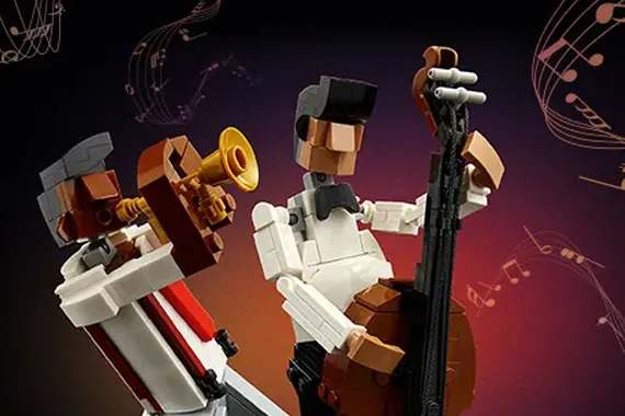
It Is Jazz Time!
I wanted to create something modern-stylish but classic at the same time. So I took inspiration from a Jazz poster from the 70s and gave it a twist using more gradients colors instead of flat colors and adding a bit of chaos to the shapes and lines. I think thatSince Jazz is based on improvisation, the chaos in the shapes may represent part of this improvisation.
Sign in to comment
You'll need to sign in to an account to post a comment.

Join the conversation