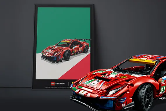
Minimalist Darker Logo Concept
Dear Team,
The idea behind my concept was the fact that Ferrari and Lego did a huge thing together.
And because both companies are well known around the world i thought it is more then enough to show only the logos in a smart way.
I used opacity to find red color on the Lego itself that will look great on the Ferrari logo.
I know very well this is not an usual look for Lego as this is more dark and minimalistic. But I thought if I would have a box like this I'd never thrown it away.
Thank you
Sign in to comment
You'll need to sign in to an account to post a comment.

Join the conversation