Creative Ideas
Hello Everyone!
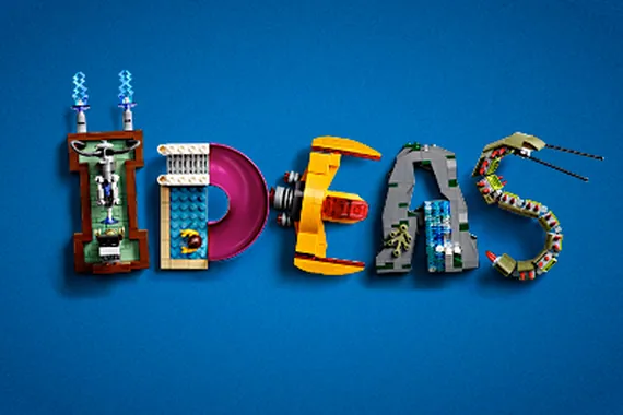
When designing the LEGO Ideas logo I had one thought in my mind: Make the logo recognisable and easy to read.
I decided not to use LDD but instead build the logo with the limited amount of lego bricks that I have. I believe that by having a limited amount of bricks in a limited amount of colors required me to be more creative.
I started with the rocket. It was added to make this logo something more than just text. Next I built the letters D and A. Due to a lack of rounded bricks the next letter I built, the letter E, is all rectangular. The letter I is all colorful due to a lack of bricks in the same color and the letter S is made out of technic pieces due to a lack of different system bricks.
I think that if I had more different and specialised pieces in different colors I could improve the build. But, you do what you can with what you have. Overall I am satisfied with my build and I hope you will appreciate this LEGO Ideas logo and the work I have put into it :)
You'll need to sign in to an account to post a comment.
Join the conversation