The finishing touch
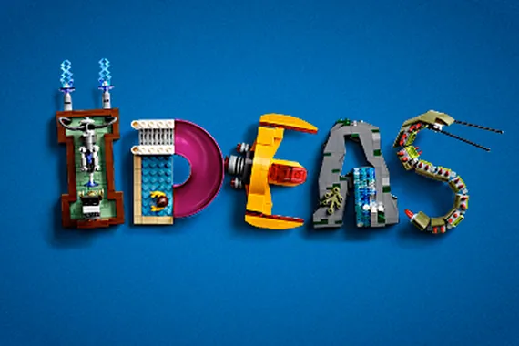
I wanted to create the LEGO Ideas logo as closely as possible in LEGO bricks including:
- the sloping top to the 'I'
- the symmetrical curves of the 'D'
- the slightly uneven spacing of the arms of the 'E'
- the shape and slope of the 'A'
- the curvature of the 'S'
- the 'floating brick' at the right at an angle and facing slightly downwards.
The letters are the same height with just about the correct spacing between them.
The design is built as far as possible without showing any studs to keep the clean design lines of the logo.
The 'S' could do with some more work :-)
LEGO Ideas are never completely finished, so I added a touch of interest and humour by showing a minifigure still painting the logo. He (or she) also shows the scale of LEGO Ideas - they are BIG!
The build uses bricks in various configuration including sideways and upside down, but of course you can't really see that when it's all 'painted' white :-)
I hope you like my construction of the LEGO Ideas Logo!
You'll need to sign in to an account to post a comment.

Join the conversation