Ideas cubed
For this entry I wanted to try a more minimalist design that would reduce down in size, and still be readable, and legible. I also wanted the logo to work on different backgrounds such as the IDEAS banner / strip you see at the top of the IDEAS website which is a dark gray, or to be exact an RGB of R: 41 G: 41 B: 41
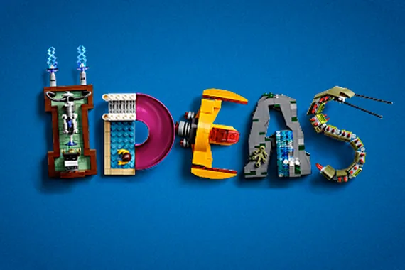
My images show variations of colors including a grayscale version, as options. The design is a roughly the proportions of a 1x1 brick, on 14 x 14 stud perimeter base. The black outlines make the image and letters pop.
After this entry is live on IDEAS larger images will be added on my Flickr. HERE
Sign in to comment
You'll need to sign in to an account to post a comment.
Join the conversation